


Autovis - Accelerate the world's transition to automation and modern technologies
Autovis is, an industrial design and engineering firm, formed by a team of highly skilled professionals dedicated to product design and engineering. Focus on consulting and designing automation solutions in the field of industry, agriculture according to requirements and trading all types of automation equipment industrial electrical equipment for design.
The name Autovis’ inspires the messages: "Automation Vision" that encourage engineering team to solve customer problems, satisfy curiosity and provide the most optimal automated solution.


Concept - Energy Movement
Autovis provides production automation solutions for manufacturing businesses, helping businesses operate more efficiently and sustainably. By building modern equipment and technology, automatic machines operate continuously and stably. The nature of the company is to operate the process of converting electrical energy into mechanical energy to operate machines more efficiently.
The company's brand design is an expression of the brand's unique identity, inspired by the transformation of two energy streams: electrical energy and mechanical energy. This design truly captures the essence of the company's business and sets it apart from the brand's competitors.
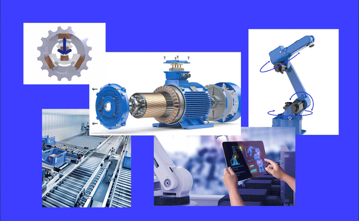
Circular motion symbolizes continuous and efficient movement. And the interacting circles serve as a visual metaphor for the aforementioned principle of energy conversion: when the current flowing in the rotor produces magnetism and interacts with the magnetic field produced by the STATOR (the stationary part of the motor), causing the ROTOR (the rotating part) to turn around its axis. As the rotor rotates, it transfers its motion to whatever it's connected to.This could be a shaft in a machinery system.


Visualization
The concept of Energy Movement describes through circular motion, the interaction of circles symbolizing the connection of energy flows to create an effective automation system. The circle also symbolizes flexibility and innovation as the vision Autovis aims for.
The blue color system is used to portray a sense of efficiency and technology and symbolizes highly skilled professionals and a dedicated team.
Images of bright, cheerful people, expressed through positive emotional interactions at work, along with graphic elements contribute to creating a modern, trustworthy and creative corporate image .


Design
The brand design system builds carefully to create a professional, energetic and creative look.
The minimalist, spacious layout and incorporation of geometric shapes, are key elements of the design, providing a clean and uncluttered aesthetic, while enhancing the flexibility of the identity system, making it easier to easy to apply, save time and effort in the design process while still ensuring high efficiency on many different platforms and sizes.
The high contrast in typography enhances the modern and contemporary Swiss design, which is commonly linked with trustworthiness and professionalism.
The image system is streamlined to convey the brand spirit and attract viewers directly with vivid, visually appealing images. Another outstanding feature of the brand design system is the blue color palette.


Thanks for watching. If you like my project, please appreciate below.


